
Brand Identity System
Totalplay Brand Family
From a single inherited logo to a full brand ecosystem spanning digital products, physical hardware, and services.
One logo. No system. No rules.
When Totalplay launched in 2009, the master logo came from Grupo Salinas. What didn't exist was everything else: no brand system, no sub-brands, no design team, and no customers. As a founding member, I took that single mark and built a full brand architecture around it — defining the color system, the typographic decisions, the iconographic language, and the governance model that would allow the brand to scale.
Over 15 years, that foundation became a complete ecosystem: a corporate variant, six digital product sub-brands, two physical product lines, and service marks, all integrated into a Design System Manager and documented in a public brandbook so any team could apply it consistently without requiring approval at every step.
One system. Many expressions.
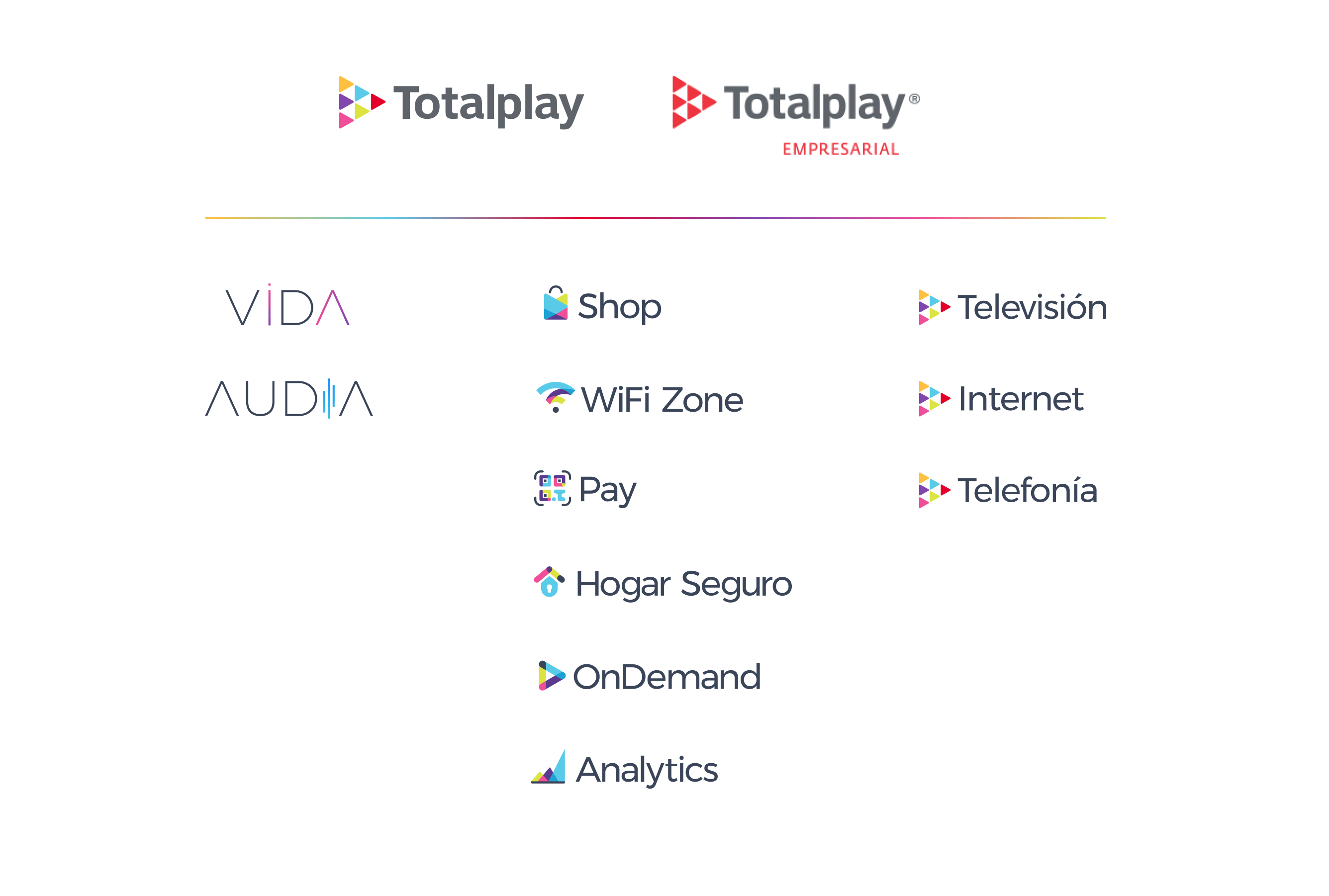
The brand family is organized in four tiers: the master brand and its corporate variant, the digital product sub-brands, the physical product lines, and the service marks: all connected by a shared visual language and governed by a central Brand Committee.
Designed to scale
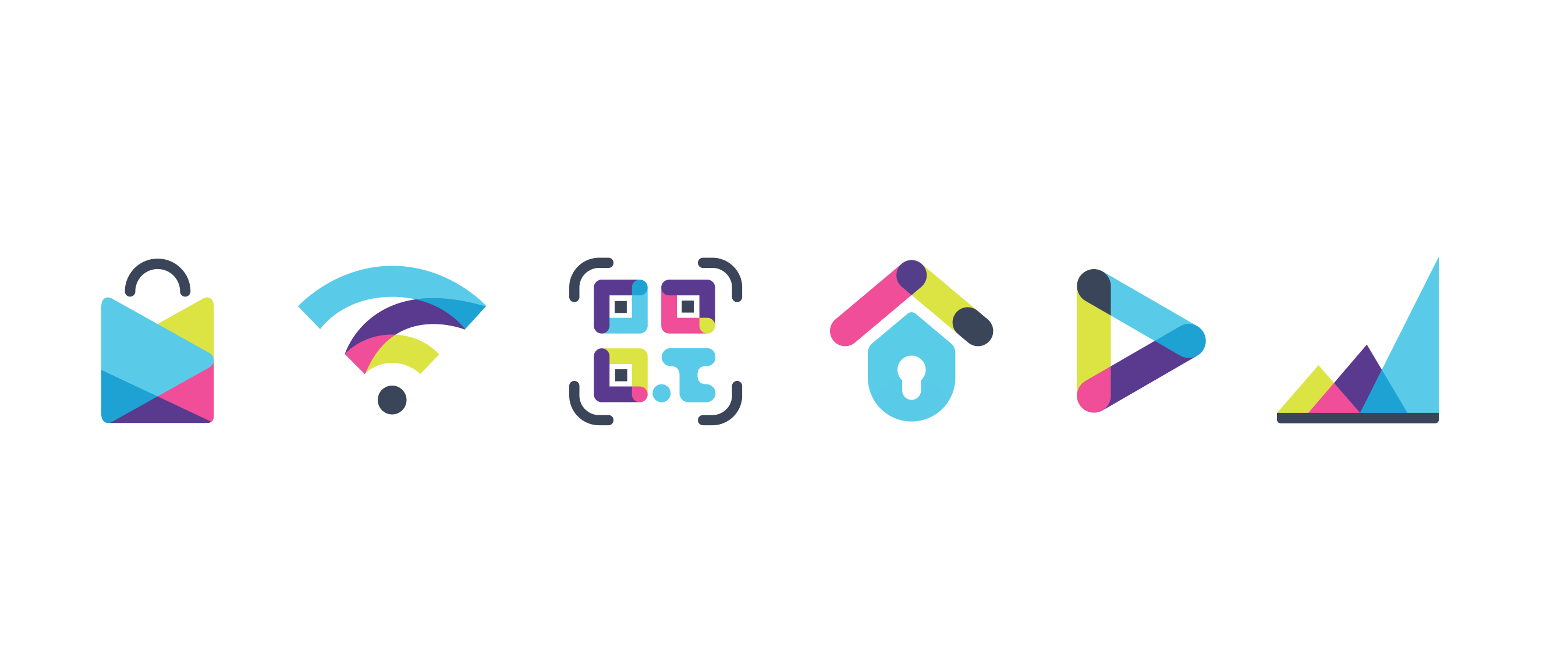
Each digital product sub-brand icon was built on the same geometric foundation as the master mark, adapted to communicate the specific function of each product — without losing coherence across the system.
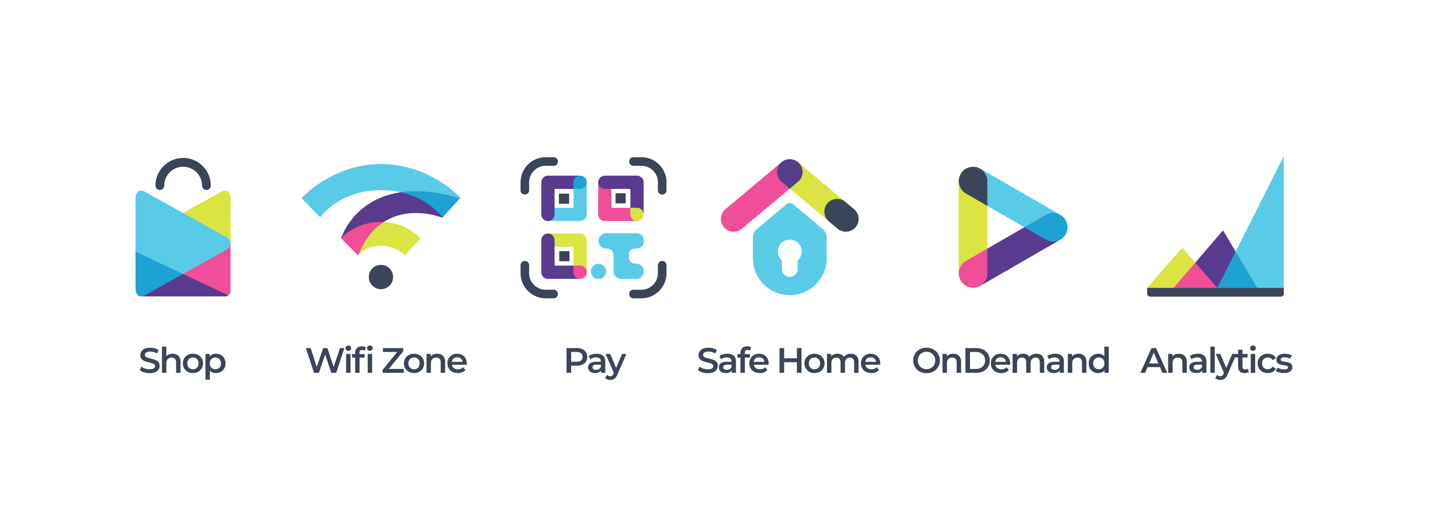
Shop: The play mark reimagined as a shopping bag, commerce through entertainment.
WiFi Zone: Signal arcs in brand colors, connectivity as a product, not just a feature.
Pay: A QR code built from brand geometry, familiar technology, distinct identity.
Safe Home: Roof and shield combined, protection framed with warmth.
OnDemand: The play mark deconstructed, content on your terms.
Analytics: Ascending peaks, data as growth, not complexity.
Why these marks look the way they do
Shop The brief needed a commerce product that felt native to an entertainment platform. Rather than a generic cart or bag icon, I took the play mark (the core of the Totalplay identity) and reframed it as a shopping bag. Same geometry, new meaning. The brand stays coherent; the product feels distinct.
WiFi Zone Connectivity was already Totalplay's core business, but WiFi Zone needed to feel like a product in its own right, not just a feature. I kept the signal arc (universally understood) and rebuilt it in brand colors, layered with the same transparency treatment used across the icon system. Familiar enough to be instant, distinct enough to own.
Analytics The audience here is media buyers and brand managers, not consumers. The icon needed to communicate authority without feeling cold. The ascending mountain geometry reads as a bar chart and a landscape simultaneously — growth that feels earned, not just measured.



From brandbook to production
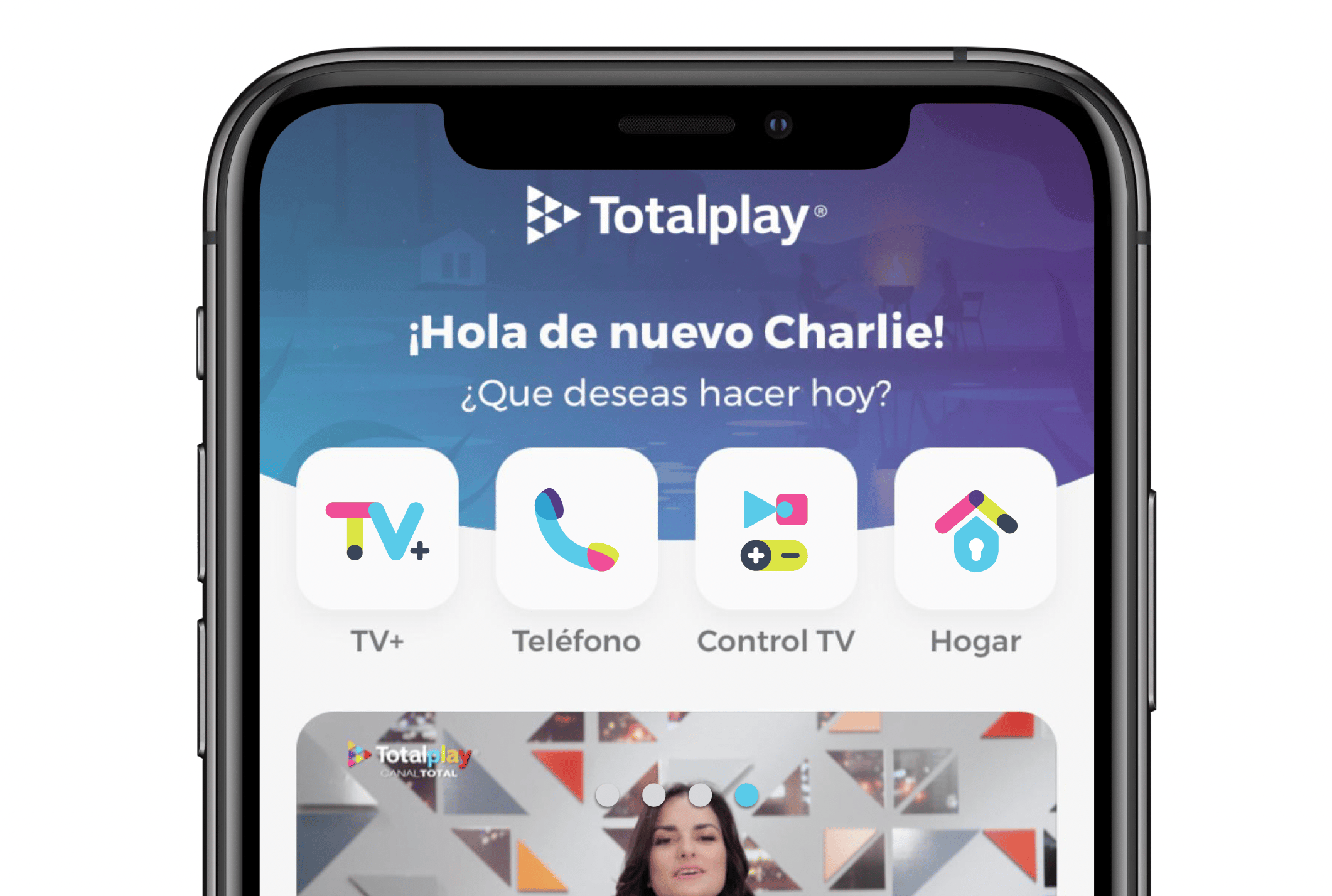
The system didn't live in a deck. Every sub-brand was integrated into the product UI, applied across TV interfaces, mobile apps, physical hardware, and commercial materials. The icon system was tokenized inside the Design System Manager so updates propagated consistently across all touchpoints.
What it built
$64M Annual revenue generated by Totalplay Shop, the first TV marketplace of its kind globally
90% Customer satisfaction among the first 1M users, driven in part by a coherent brand experience across all touchpoints
15+ Sub-brands governed under a single identity system, applied consistently across product, marketing, and engineering
The goal of this system was to make consistency the path of least resistance for designers, engineers, and marketers alike.